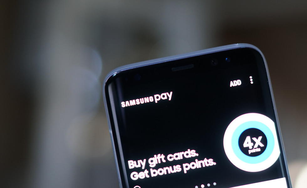
 Samsung Pay users, be on the lookout for a new update, labeled as build 2.8.18. Inside this update, Samsung includes an updated UI, one that users are apparently liking quite a bit.
According to one user on reddit, “I opened the updated app and was like WOW! They have now ditched the on screen section menus for a more traditional bottom bar now! It looks really clean and everything is really tidy!”
That’s either a very excited user or a Samsung employee posing as an excited user.
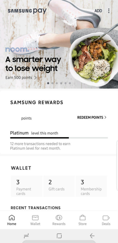
A cleaner Samsung Pay UI
Either way, as they stated, Samsung has moved to a more traditional UI, opting for a bottom nav bar with options for viewing your wallet, checking on rewards, and visiting the Pay store. Overall, it should be a cleaner and more easily navigable experience.
Go grab that update!
Google Play Link
// reddit | @WinDroidGuy
Samsung Pay Picks Up New UI, Includes Bottom Nav Bar and Cleaner Look is a post from: Droid Life
Samsung Pay Picks Up New UI, Includes Bottom Nav Bar and Cleaner Look
No comments:
Post a Comment