 Back at Google I/O, Google showed off the next big UI update for Android TV that would arrive with Android Oreo. You probably know little about it and likely have never seen it because no Android TV has it outside of the Nexus Player, a device you can no longer buy. With that said, Google is doing big things with Android TV at CES 2018 this week and has provided a refresher, through their Google Play Dev blog, on the big changes that are coming. Our guess is that this refresher is here because the update is closer than ever to rolling out on current and new Android TV products.
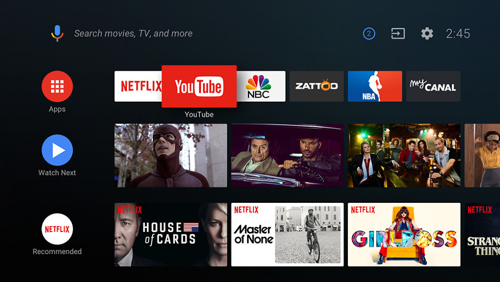
The biggest change here is the layout of the home screen. As you can see below, apps are now featured vertically, with their own content listed next to them horizontally (Google calls it “channel-based”). This allows you to not only see the apps you use the most, but also the available content. While the layout will take some getting used to, it should help with discovery, since content from apps are now shown without having to enter the app.
These channels can be programmed by app developers to show promoted content, a specific order of programs, and branding. But there can be custom channels too, potentially by topic or user interest. That means a custom channel experience on your Android TV home screen.
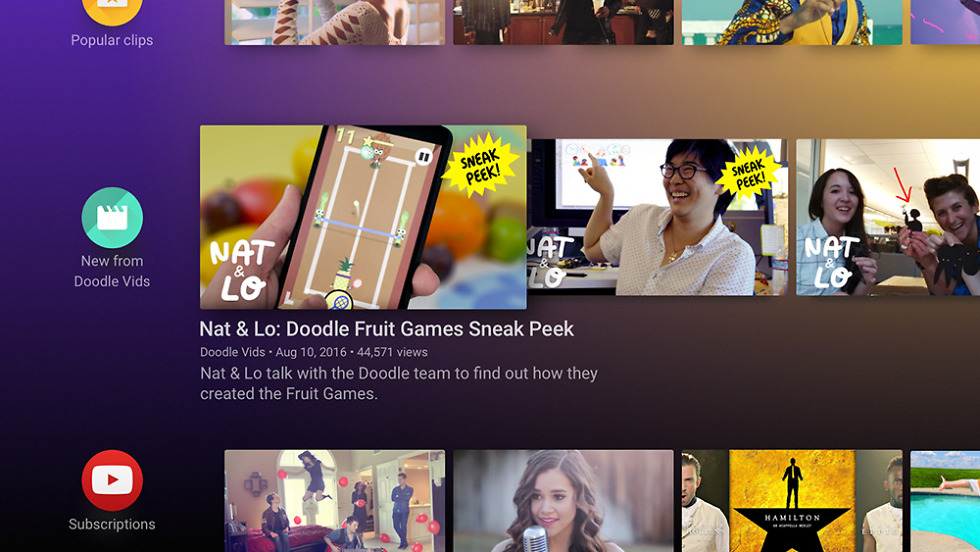
And finally, the new Android TV design features animated previews of programs as they are highlighted when you browse. Think of it like YouTube’s live preview feature on desktop that shows you a short clip when you hover your mouse over a video thumbnail.
Today’s blog post from Google didn’t say when we should expect Android Oreo to arrive on more Android TV sets, but again, if they are once again pushing the message of it, I’d imagine they want to start rolling it out. Plus, new products are most definitely launching with Oreo inside.
// Google Play Devs
Google Further Details Android TV Oreo Update With Redesigned UI is a post from: Droid Life
Google Further Details Android TV Oreo Update With Redesigned UI
No comments:
Post a Comment